
Flexbox Basics:
Understanding Flatsome
Note that you should not need to touch the builder / html for these exercises.
Note that you should not need to touch the builder / html for these exercises.
Today’s training objective is to make sure everyone has a basic knowledge of how Flexbox works and see how Flatsome is applying Flexbox to their core positioning elements: rows & columns. By knowing how Flatsome works at the core, you’ll be able to better diagnose and troubleshoot problems when they arise, as well as be able to manipulate Flatsome to do things out of it’s basic functionality.
Today there is only one challenge broken up into steps. We are going to be building some cards from scratch in the same structure Flatsome does it. The code you will be adding css to is at the bottom of this page. This is going to involve all the basics of flexbox as well as some nested flexbox. Let’s go through it step by step…
Note that there is some custom css added to make the buttons line up. Everything else is out of the box.


Lorem ipsum dolor sit amet, consectetuer adipiscing elit, sed diam nonummy nibh euismod tincidunt ut laoreet dolore magna aliquam erat volutpat.


Lorem ipsum dolor sit amet, consectetuer adipiscing elit, sed diam nonummy nibh euismod tincidunt ut laoreet dolore magna aliquam erat volutpat tincidunt ut laoreet dolore magna.
Lorem ipsum dolor sit amet, consectetuer adipiscing elit, sed diam nonummy nibh euismod tincidunt ut laoreet doloret.
To fully understand how Flatsome functions, you’re going to need to know how the html is setup first. In the graphic and code below, I’ve drawn out the containers of how Flatsome has structured the layout above.
Goal: Take a few minutes to make sure you really understand this structure. Go through the code below the graphic line by line and make sure you understand what is related to what.
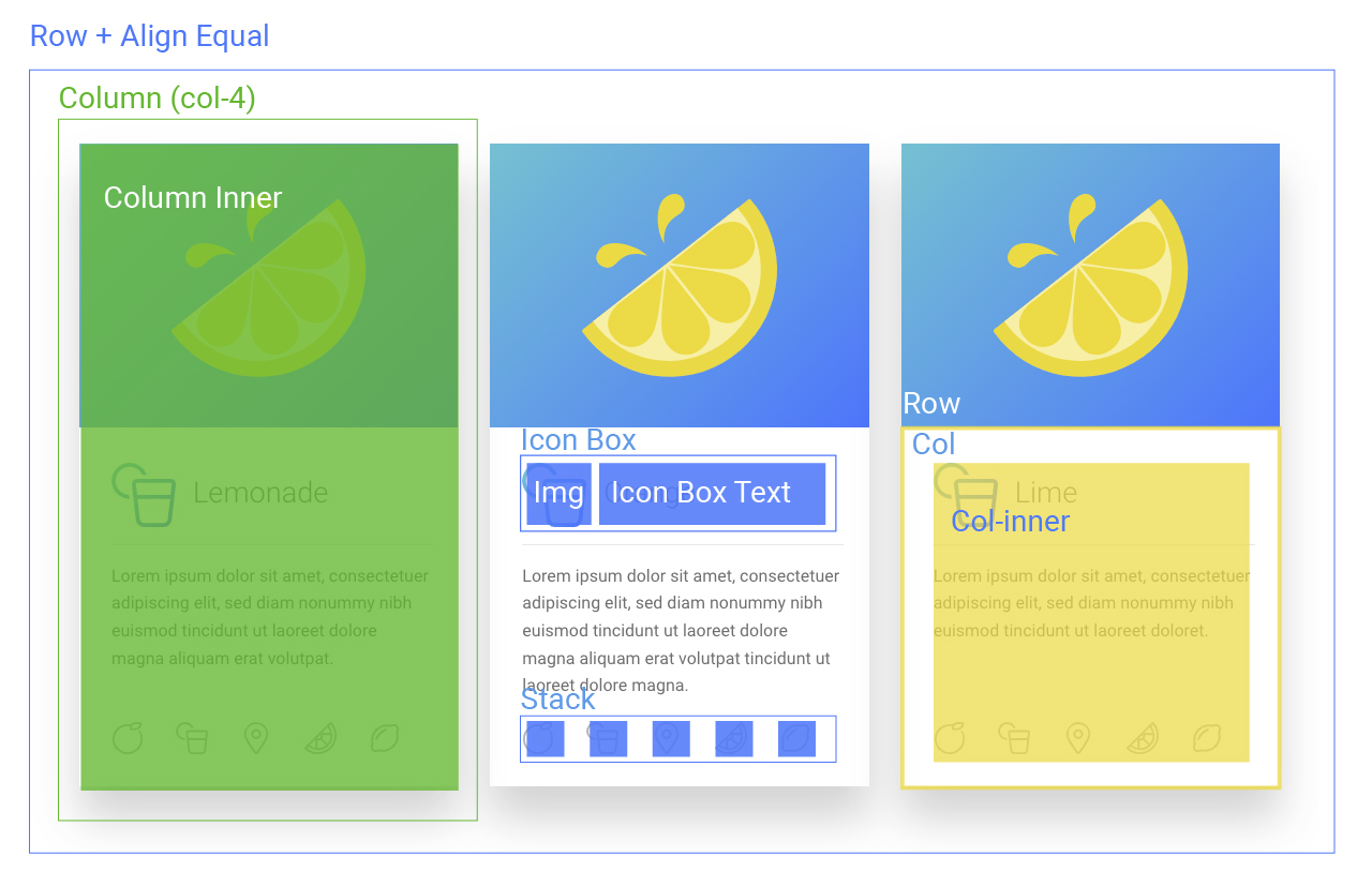
Layout Structure:
<row class="ls-row ls-align-equal">
    <div class="ls-col">
        <div class="ls-col-inner">
            * COLUMN CONTENT *
        </div>
    </div>

    <div class="ls-col">
        <div class="ls-col-inner">
            * COLUMN CONTENT *
        </div>
    </div>

    <div class="ls-col">
        <div class="ls-col-inner">
            * COLUMN CONTENT *
        </div>
    </div>

</div>
Column Content + Inner Structure:
<div class="ls-col">
    <div class="ls-col-inner">

        <div class="ls-icon-box">
            <div class="icon-box-img"style="width: 60px">
                <div class="icon">
                    <div class="icon-inner">
                        <img src=""/>
                    </div>
                </div>
            </div>

            <div class="icon-box-text last-reset">
                <h3 class="mb-0">Lemonade</h3>
            </div>

         </div>

         <div class="is-divider divider clearfix"style="max-width:100%;height:1px;"></div>

         <p>Lorem ipsum dolor sit amet, consectetuer adipiscing elit, sed diam nonummy nibh euismod tincidunt ut laoreet dolore magna aliquam erat volutpat.</p>

         <div class="ls-stack">

             <img src=""/>
             <img src=""/>
             <img src=""/>
             <img src=""/>
             <img src=""/>

         </div>
     </div>
</div>
*full image code not used to make code shorter
At the bottom of this page you will find the result of the plain html structure with no Flatsome influence other than on the buttons and images. We’re going to add flexbox to this structure to form the layout.
At this point your main structure for your cards should be complete. Now we need to add some flex to our inner elements.
There’s an interesting property with margins where if you add a margin: auto in combination with a flex box, the margin will fill all the extra space that it can.
What this means is that if our parent container is the full row height and using flex, we can add margin-top: auto to our stack and the margin will fill any extra space, pushing out stack to the bottom of the container. The challenge here is getting the parent container to the full height of the outer row.
Go through each of your containers and find the containers that need their heights adjusted (there were 2 in my final code). Add flex to the correct container and margin-top: auto to the stack.
.ls-row{
	display: flex;
	flex-direction: row;
	flex-wrap: wrap;
	max-width: 1150px;
	margin-left: auto;
	margin-right: auto;
}

.ls-row .ls-row{
	margin-left: -15px;
	margin-right: -15px;
}

.ls-row > .ls-col-4{
	flex-basis: 33.3333333333%;
        max-width: 33.3333333333%;
}

.ls-col{
	padding: 0 15px 30px;
}

.ls-row > .ls-col-4 > .ls-col-inner{
	box-shadow: 0 30px 40px 0 rgba(0, 0, 0, .2);
}

.ls-align-equal > .ls-col{
	display: flex;
}

.ls-col-12 .ls-col-inner{
	padding: 30px 30px 15px 30px;
}

.ls-icon-box{
	display: flex;
	flex-direction: row;
	flex-wrap: wrap;
	align-items: center;
}

.ls-icon-box .icon-box-text h3{
	padding-left: 15px;
}

.ls-stack{
	display: flex;
	flex-direction: row;
	flex-wrap: nowrap;
	justify-content: space-between;
	margin-top: auto;
}

.ls-align-equal .ls-col-inner{
	height: 100%;
}

.ls-align-equal .ls-row{
	height: 100%;
}

.ls-col-inner{
	display: flex;
	flex-direction: column;
	flex-wrap: nowrap;
}
Lorem ipsum dolor sit amet, consectetuer adipiscing elit, sed diam nonummy nibh euismod tincidunt ut laoreet dolore magna aliquam erat volutpat.
Lorem ipsum dolor sit amet, consectetuer adipiscing elit, sed diam nonummy nibh euismod tincidunt ut laoreet dolore magna aliquam erat volutpat tincidunt ut laoreet dolore magna.
Lorem ipsum dolor sit amet, consectetuer adipiscing elit, sed diam nonummy nibh euismod tincidunt ut laoreet doloret.