CSS Positioning
Note that you should not need to touch the builder / html for these exercises.
Note that you should not need to touch the builder / html for these exercises.
With CSS positioning, there are 3 core things you need to know:
Don’t confuse positioning for display. Display flex, block, inline-block, grid, etc do not (and cannot) pull elements out of the normal flow of the site. Instead they change the way the elements flow.
As an example, display: flex with a flex-direction: row is going to allow children to flow next to each other horizontally. This is not pulling them out of the normal flow, but only changing the way they flow.
What are the non-static position options?
Top, Bottom, Left, Right, z-index
After you declare your position type, you can also tell your element where you want it to go. For example, top: 100px will tell your element to move 100px from the top of your element’s relative. It’s usually a good idea to set one horizontal direction (left or right) and one vertical direction (top or bottom).
z-index deals with the “z” axis of a 3D graph. Basically all this means is the higher the z-index number, the higher the element appears in the stacking order. Where it get tricky is 1) static elements have no z-index, and 2) child elements can only go as high as their parent. If you are having z-index trouble, check if either of these things are the case.
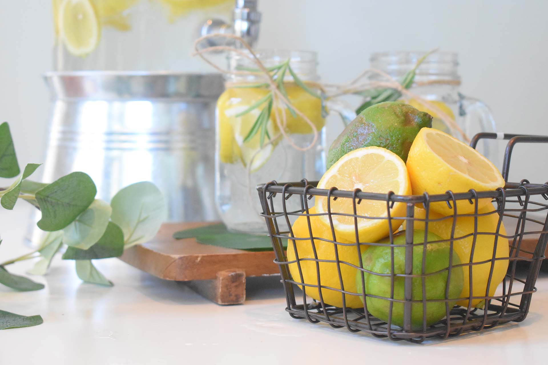
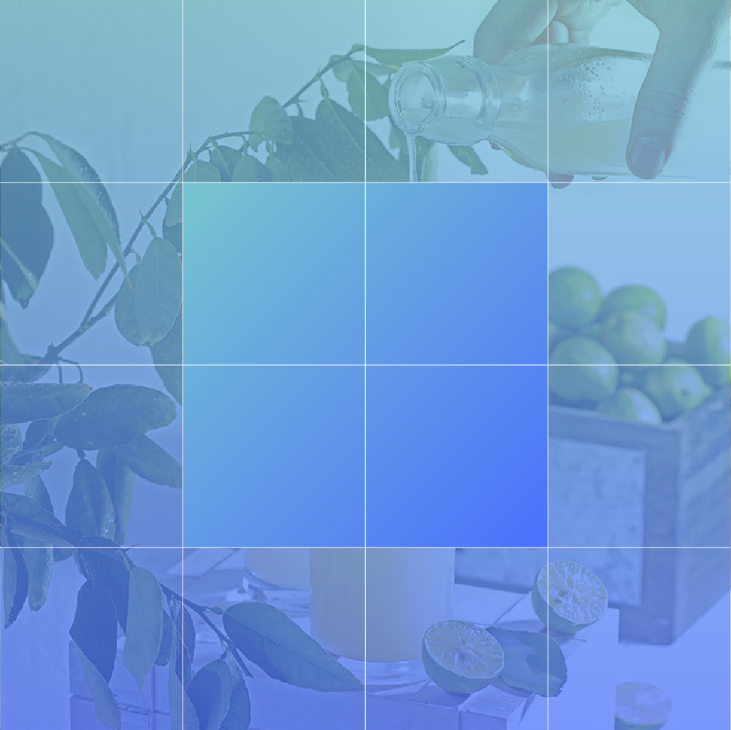
For the first challenge, in the section below position the 4 lemon icon blocks in the 4 gradient zones of the grid image. Make sure to use percentages so everything scales together.
These images below have been coded into the page using an html block so you can see how positioning works without any influence from Flatsome. Take a look at the code structure here to help you complete the challenge.
<div class="custom-row">
<div class="custom-column">
<div class="lemon-grid-container">
<img src="/wp-content/uploads/2024/03/grid-100.jpg" alt="Lemonade Grid" class="lemon-grid"/>
<img src="/wp-content/uploads/2024/03/lemon-block.svg" alt="Lemon Block" class="lemon-block lemon-block-1"/>
<img src="/wp-content/uploads/2024/03/lemon-block.svg" alt="Lemon Block" class="lemon-block lemon-block-2"/>
<img src="/wp-content/uploads/2024/03/lemon-block.svg" alt="Lemon Block" class="lemon-block lemon-block-3"/>
<img src="/wp-content/uploads/2024/03/lemon-block.svg" alt="Lemon Block" class="lemon-block lemon-block-4"/>
</div>
</div>
</div>


.lemon-grid-container{
	position: relative;
}


.lemon-block{
	position: absolute;
	width: 25%;
}


.lemon-block-1{
	top: 0;
	left: 0;
}

.lemon-block-2{
	top: 0;
	right: 0;
}

.lemon-block-3{
	top: 25%;
	left: 50%;
}

.lemon-block-4{
	bottom: 0;
	left: 25%;
}
Now that you’ve positioned without Flatsome, let’s look how things change with Flatsome. Position the lemon block in the square on the image on the right. You shouldn’t need much code since Flatsome adds position: relative for you. The class on the Flatsome image elements is “lemon-block-center” Make your code work for any sized element and not just this block that is 50% of the width of the container.
A note on centering: When using top / left / right / bottom, your element is going to move from the edges rather than from center. Common practice for fixing this is using a negative transform on the element. It should be structured like this: transform: translate(X, Y); where X is how much you want to move in the X direction and Y is how much you want to move in the Y direction. Transforms are based on the element itself, not on the relative item, so transform: translate(10%, 10%) will move 10% of the element’s width from its current position.

.lemon-block-center{
	position: absolute;
	top: 50%;
	left: 50%;
	transform: translate(-50%, -50%);
}

For this exercise, pretend the lemon icon here is a type of chat button. We want to position it 100px from the bottom and flush with the right edge of the window. It should scroll with the user so it’s always visible. The button has a class called “chat-button”
.chat-button{
	position: fixed;
	bottom: 100px;
	right: 0;
	margin-right: 0;
	margin-bottom: 0;
}

For this challenge, make the sticky menu scroll with the user only while they are in this text section. Make sure the sticky menu doesn’t go below the sticky header. The column 4 has a class called “sticky-menu”
Lorem ipsum dolor sit amet, consectetur adipiscing elit. Morbi molestie felis vel lectus pulvinar vestibulum. Nam ultrices in sapien eget pulvinar. Curabitur non ipsum sed velit gravida ullamcorper. Maecenas feugiat erat id leo eleifend pharetra. Pellentesque sit amet maximus eros. Nulla facilisi. Nam porta tincidunt enim non volutpat. Suspendisse nunc neque, ullamcorper sed ipsum a, aliquam egestas est. Duis at ultricies massa. Integer sagittis sem eu turpis feugiat, at rhoncus arcu faucibus. Ut turpis dui, porttitor non varius id, commodo eu augue. Aenean euismod leo sed enim eleifend scelerisque. In hac habitasse platea dictumst. In ac condimentum nulla, eu varius quam. Maecenas aliquet ante eget nunc dignissim rhoncus. Quisque non maximus libero.
Nulla facilisi. Integer sagittis maximus nunc eget venenatis. Integer non pretium dui. Suspendisse blandit dignissim mi, a aliquam nisi viverra eget. Etiam condimentum diam in lorem ultricies accumsan. Vestibulum scelerisque aliquet nibh sit amet fermentum. Proin commodo velit ac blandit pretium. Praesent placerat dictum elementum. Duis viverra blandit justo. Sed tempor, neque ut ornare consectetur, nisi purus blandit justo, id dapibus lorem sapien eget ante. Quisque luctus, enim a dignissim tincidunt, urna nisi congue mauris, at ultrices arcu nibh vitae elit. Fusce vitae sem quam.
Suspendisse potenti. Nunc lacinia metus nisi, a tincidunt nulla varius sed. Duis ac nunc id ligula ultrices tincidunt. In egestas gravida metus, vitae sodales turpis consequat eu. Nam tincidunt, felis vel mattis iaculis, ligula enim gravida justo, eget finibus nisi leo quis nunc. Proin aliquam ipsum ante, sed eleifend lacus congue sit amet. Phasellus tempus, ligula at pharetra facilisis, ligula lectus dignissim orci, ut volutpat tellus nibh ac tellus. Nam eleifend sed lectus sit amet laoreet. Pellentesque elit nibh, lacinia eu ante a, luctus finibus nunc. In in justo quis felis sollicitudin scelerisque.
Praesent auctor, ipsum sit amet sagittis sodales, urna nulla lobortis turpis, quis blandit nisi sem nec tellus. Aenean gravida felis urna, quis egestas felis ornare eu. Pellentesque ultricies sem a fringilla commodo. Nullam risus mauris, egestas nec aliquam vitae, porta a massa. Ut posuere aliquam ipsum, id iaculis nisi tincidunt eu. Aliquam sit amet metus fermentum, varius sem id, scelerisque lacus. Curabitur porttitor consequat felis, sed rutrum turpis interdum vitae. Quisque eu posuere ligula. Cras eget ipsum malesuada, malesuada quam quis, ornare risus. Duis et justo tincidunt turpis ultrices porta eget vitae erat.
Sed venenatis velit nulla, et congue urna elementum vitae. Praesent faucibus dictum elit sit amet malesuada. Pellentesque tempus tristique nunc, non feugiat odio vulputate eu. Donec ipsum sem, semper a sagittis ut, dignissim sit amet metus. Curabitur et mauris at risus faucibus elementum nec a ex. Quisque commodo aliquam libero. Ut diam ex, ultrices eget feugiat non, rutrum ut ipsum. Nam augue eros, viverra ut varius blandit, sodales sit amet libero. Vestibulum in suscipit felis.
.sticky-menu .col-inner{
	position: sticky;
	top: 150px;
}
Note that you can now do this in the Flatsome builder. On the column, select sticky and it should do the same thing as this css code.
As mentioned in earlier, Flatsome likes to add a position relative to all its structural elements. However, sometimes that can be a challenge as the relative is not set on the element we need. Position the lemon divider to the bottom of the section. Unset position relative as needed. The section has a class called “lemon-divider-container” and the divider image has a class called “lemon-divider”
.lemon-divider-container .relative{
	position: unset !important;
}

.lemon-divider{
	position: absolute;
	left: 0;
	bottom: -1px;
}
We haven’t really talked about z-index yet in this challenge. Z-index, though simple in concept, can get tricky really quickly, so it’s best to only use it as needed. Sometimes all we need to do to fix a stacking problem is switch a static element to a relative one. Remember that a static element can’t have a z-index, so using relative will allow the element to stack where it couldn’t before. If ordered correctly in the html (elements that come later will stack on top of earlier ones), the relative element will come to the front.
In the column to the right, there’s a text box hidden below the image. In the html, the text comes after the image. Use the relative trick on the text box with the class “make-visible”
Lorem ipsum dolor sit amet, consectetuer adipiscing elit, sed diam nonummy nibh euismod tincidunt ut laoreet dolore magna aliquam erat volutpat. Lorem ipsum dolor sit amet, consectetuer adipiscing elit, sed diam nonummy nibh euismod tincidunt ut laoreet dolore magna aliquam erat volutpat.
Note: When you’re in the builder you can use Flatsome’s “relative” class on the text element rather than adding your own class like we did here.
.make-visible{
	position: relative;
}
Note: When you’re in the builder you can use Flatsome’s “relative” class on the text element rather than adding your own class like we did here.