Before and After Classes in CSS

Note that you should not need to touch the builder / html for these exercises.

Things to know about :before and :after

What are :before and :after?

  • They are a way to insert content using only CSS
  • :before and :after are pseudo classes – a pseudo class targets a specific part or state of your selector and are written with a colon e.g. .myclass:hover is a pseudo class that targets a state. 
  • Adding a before / after is very similar to adding a <span> element inside of the element you are putting it on, but without using any html. 

Why use a before / after?

  • Add something to all the elements at once without having to add it manually. In fact, Flatsome is using a before to add the carets to these list items. Some other examples would be automatically adding quotes around blockquote elements, or adding an overlay to an image. 
  • They can be helpful when you don’t have access to the html but need to add in another element. Do note that these elements should never contain important SEO content as it most likely will not be indexed.

Things to know when using before / after elements:

  • Before and after elements are children of the element you add them to. :before will be the first child, :after will be the last child. 
  • When first declaring a before / after on an element, always use the content property even if it’s empty (content:”;)
  • Before / after are display: inline by default, similar to a span. If you want to change sizing, you will most likely need to change the display to inline-block or block. 
  • One colon or two colons are both accepted (.myclass::before or .myclass:before)
  • You can call an image with before / after by writing content: url(‘/your-image/location-url’).
  • If sizing of an image becomes an issue (which is common), you can set the content to empty and set the image as a background image instead – you’ll have to set a specified height and width for this method.    
  • You can combine pseudo classes. Need your before to have a hover effect? You can write .myclass:hover:before
Challenge 1

Getting Started

For this first exercise, add a before and after to the blockquote <p> tags to add quotes automatically. 

Lorem ipsum dolor sit amet, consectetuer adipiscing elit, sed diam nonummy nibh euismod tincidunt ut laoreet dolore magna aliquam erat volutpat.

– Quote Author

Challenge 2

Layered images

This image column has a class called “lemon-layer” on it. Make this class absolute position Lemonade Stand’s icon to the bottom left corner without adding the image in the builder / html. The lemon icon should be be layered beneath the image. 

Image icon link: /wp-content/uploads/2024/01/lemon-icon.svg

Image size: 40% of the parent container

Image Location: 10% outside (bottom & left) of the parent container

Challenge 3

Gradient on hover

This image has a class called “image-hover” on it. When you hover on the image, make a 70% opacity gradient overlay appear over the image. Don’t forget to add a transition so the hover effect looks smooth.

Gradient code:

background: rgb(76,115,252);
background: linear-gradient(270deg, rgba(76,115,252,1) 0%, rgba(118,194,208,1) 100%);

Challenge 4

Add Icons to Tab Groups

Icon

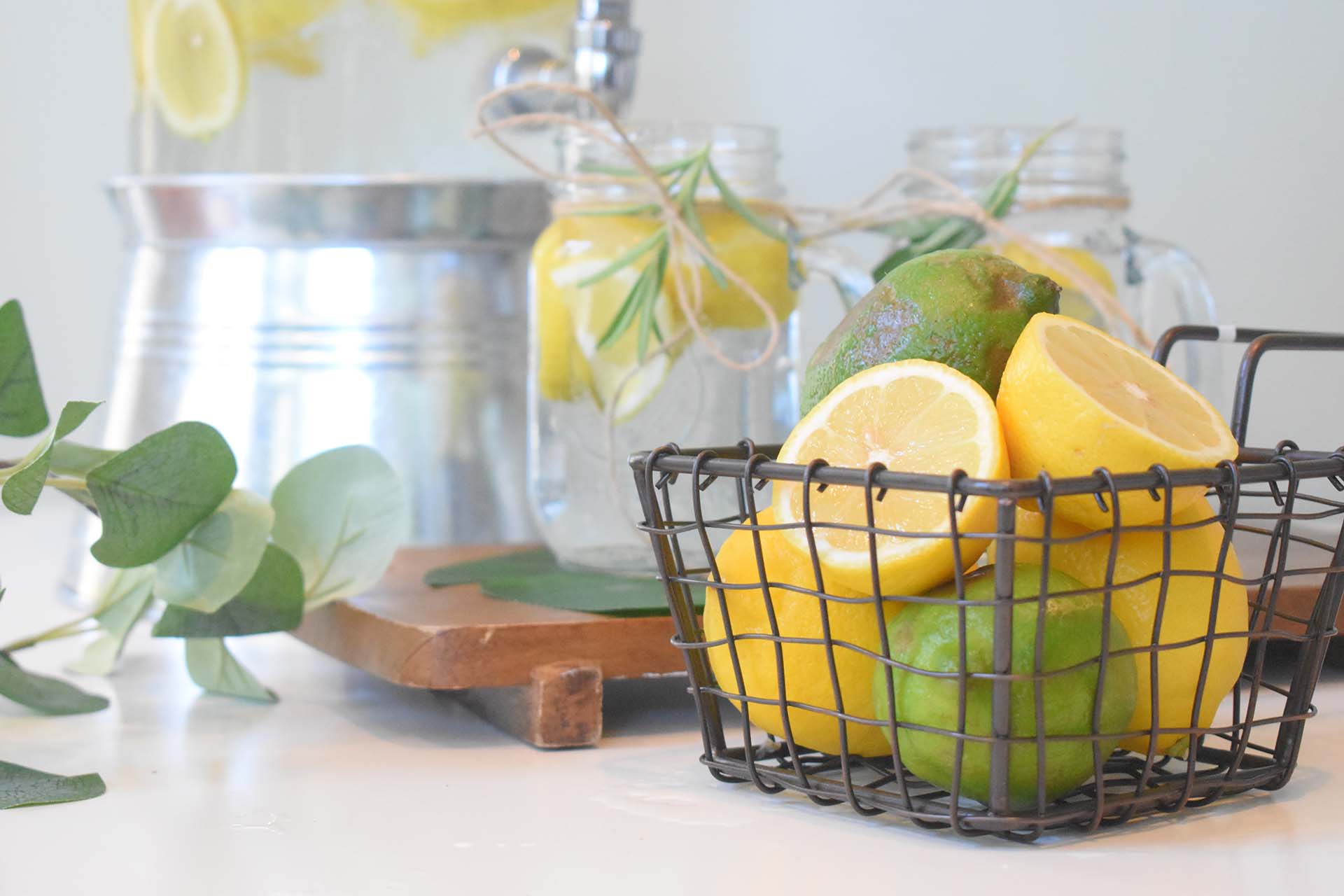
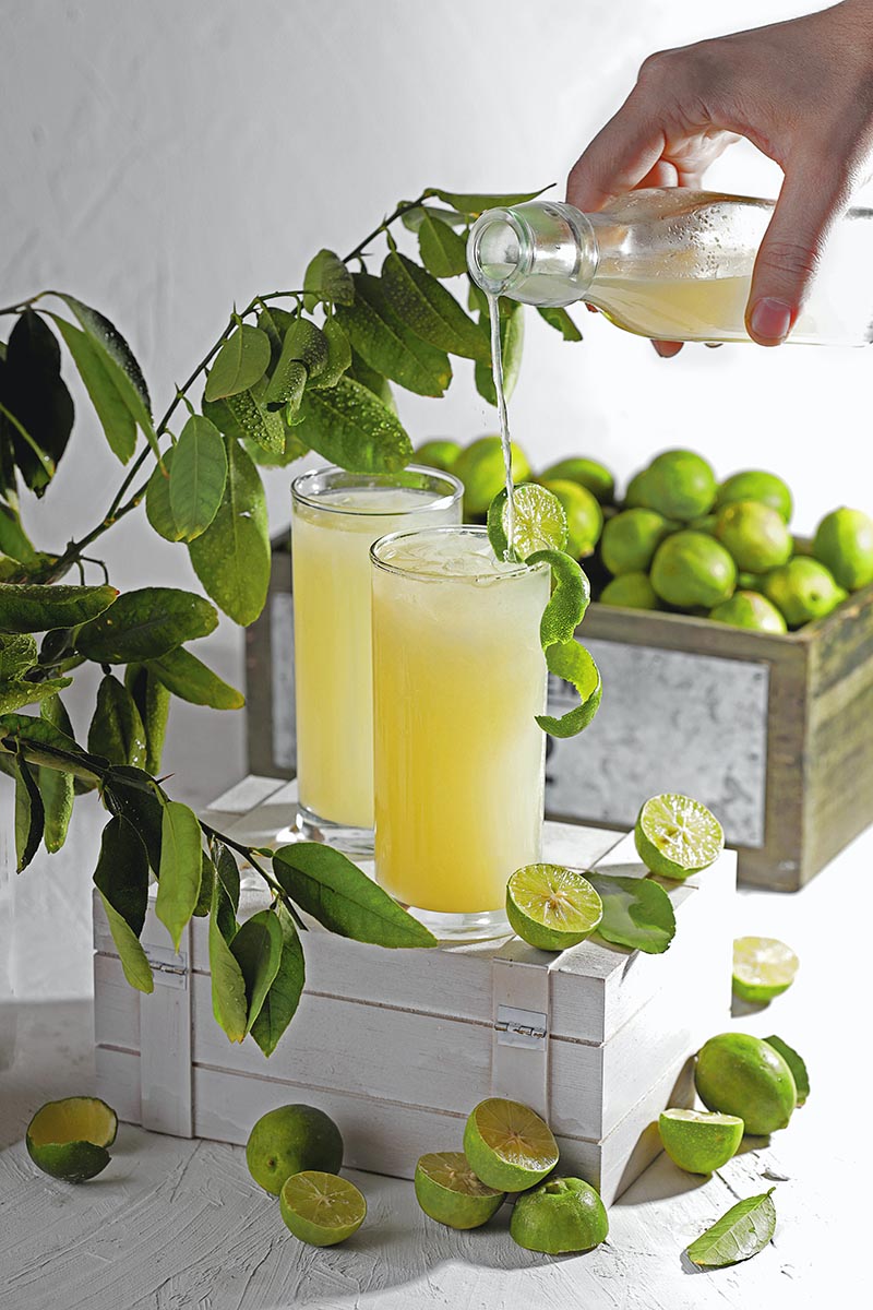
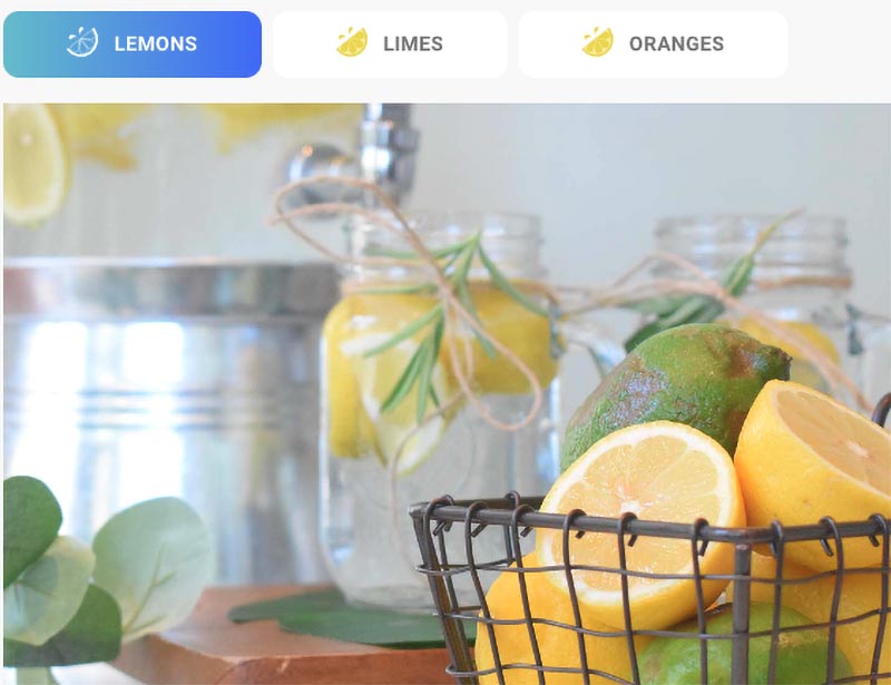
For this challenge, add an icon to each of the tabs above. The tab group has been given the name “lemon-tabs.” The final result should look like the screenshot below. Don’t forget to style the active state to look different than the inactive tabs. 

Icon: /wp-content/uploads/2024/01/lemon-icon-1.svg

White icon:  /wp-content/uploads/2024/01/dark-bg-lemon-icon-1.svg

Active Gradient: background: rgb(76,115,252);
background: linear-gradient(270deg, rgba(76,115,252,1) 0%, rgba(118,194,208,1) 100%);

Bonus Challenge

Add Hover Effect to Menu

For this challenge, add the lemon logo icon to each menu option: 

Lemon link: /wp-content/uploads/2024/01/lemon-icon-1.svg

Hide the lemon until the menu option is hovered. When you hover, have the lemon slide in and push the menu option over. The class for the menu is “lemon-hover”

Center the icons within their container: 

*Note: This is not a before / after challenge. The class on the icons is “center-icons”