Challenge 1
Why Are the Fonts Acting Weird?
Why is everything in this section acting like <h6> titles? Find the error and fix it. (answer: the h6 tag wasn’t closed properly)
Click me!
Why is everything in this section acting like <h6> titles? Find the error and fix it. (answer: the h6 tag wasn’t closed properly)
Click me!Answer: Size the icons with the same ratio (usually square). Pull the buttons out of the icon box so they can use the row flex box to align themselves.
Lorem ipsum dolor sit amet, consectetur adipiscing elit. Morbi ut orci mi. Cras eget tortor massa. Sed at interdum libero, vel aliquam sem.
Lorem ipsum dolor sit amet, consectetur adipiscing elit.
Lorem ipsum dolor sit amet, consectetur adipiscing elit. Morbi ut orci mi. Cras eget tortor massa. Sed at

Answer: Desktop size was not set, so it was taking on the mobile size. Either remove the mobile value or add a Desktop text size.
Text by default is position static which means the browser will display it before any other z-index type elements. If we use the class “relative” to put position: relative on our text element, this makes it an element with a z-index and will bring it to the top.
Another option is to use the z-index classes in flatsome to give the text box a z-index. z-top is usually does the trick. There is also z-1 through z-5 if you need to be more fine tuned.
To fit the layout better, this map needs to be full width with a narrower height. To complete this challenge complete these two tasks:
Hint: Something to accomplish this already exists in the child theme.
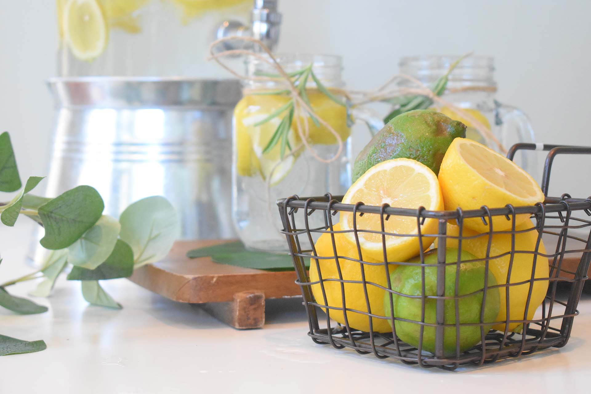
The CSS code from this tutorial on the internal site has been added to this site. Implement it on these cards so that when clicked they open https://www.lemonadestand.org/.
Also, these cards need a 10px border radius. Make the images follow the 10px radius setting (notice the top left and right corners are not rounded even with the setting turned on).
Lorem ipsum dolor sit amet, consectetuer adipiscing elit, sed diam nonummy nibh euismod tincidunt ut laoreet dolore magna aliquam erat volutpat.
Lorem ipsum dolor sit amet, consectetuer adipiscing elit, sed diam nonummy nibh euismod
Add the class align-icons. Note that in most cases this doesn’t work great when there’s more than one line of text
The image in this row is being absolutely positioned using the “Fill” class in Flatsome. That means it will take on 100% of both the height and width of it’s parent container (the column).
Since this row is set to equal, the image is taking on the height of these two text cards on Desktop. Once it breaks to it’s own row on mobile there is no height so it appears that the image is gone. Set the padding on mobile to set a new height. Don’t forget to set the Desktop to 0px.


In the live view of this section, the form is squished. Why? Can you fix it?
The classes on row-equal are messing with the form. Either set the row to align top (we don’t really need the equal functionality here) or use the no-align class on the row.
Fill out the form and our team will get in touch soon!