Challenge 1
Welcome Web Team to the Mobile Challenge!
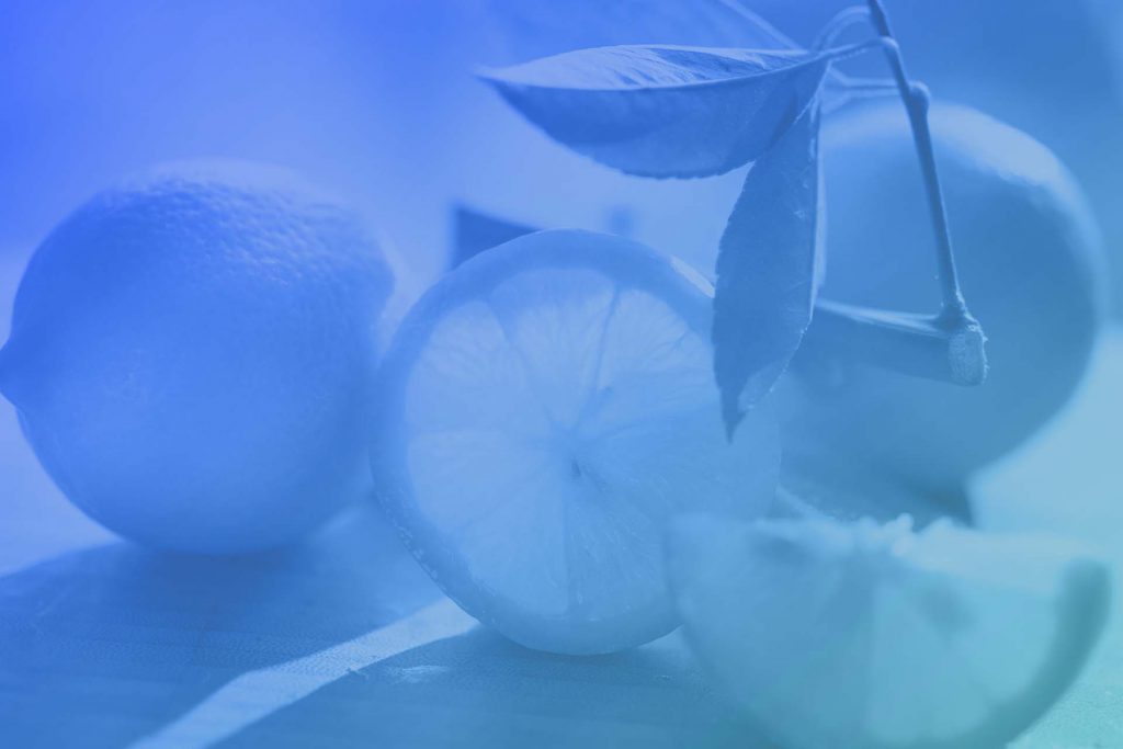
For this first section, your job is to center this entire column to a 10 column on mobile without making it centered on desktop.
Hint: You May Need another row
For this first section, your job is to center this entire column to a 10 column on mobile without making it centered on desktop.
Hint: You May Need another row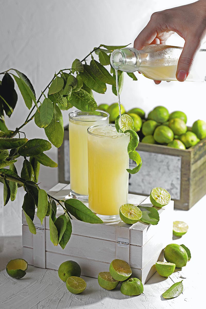
Flatsome does not have a built in way to change the height of an image on mobile. We can get around this by using the Flatsome “fill” class normally used on sections and banners to make the image fill the entire space of its parent container.
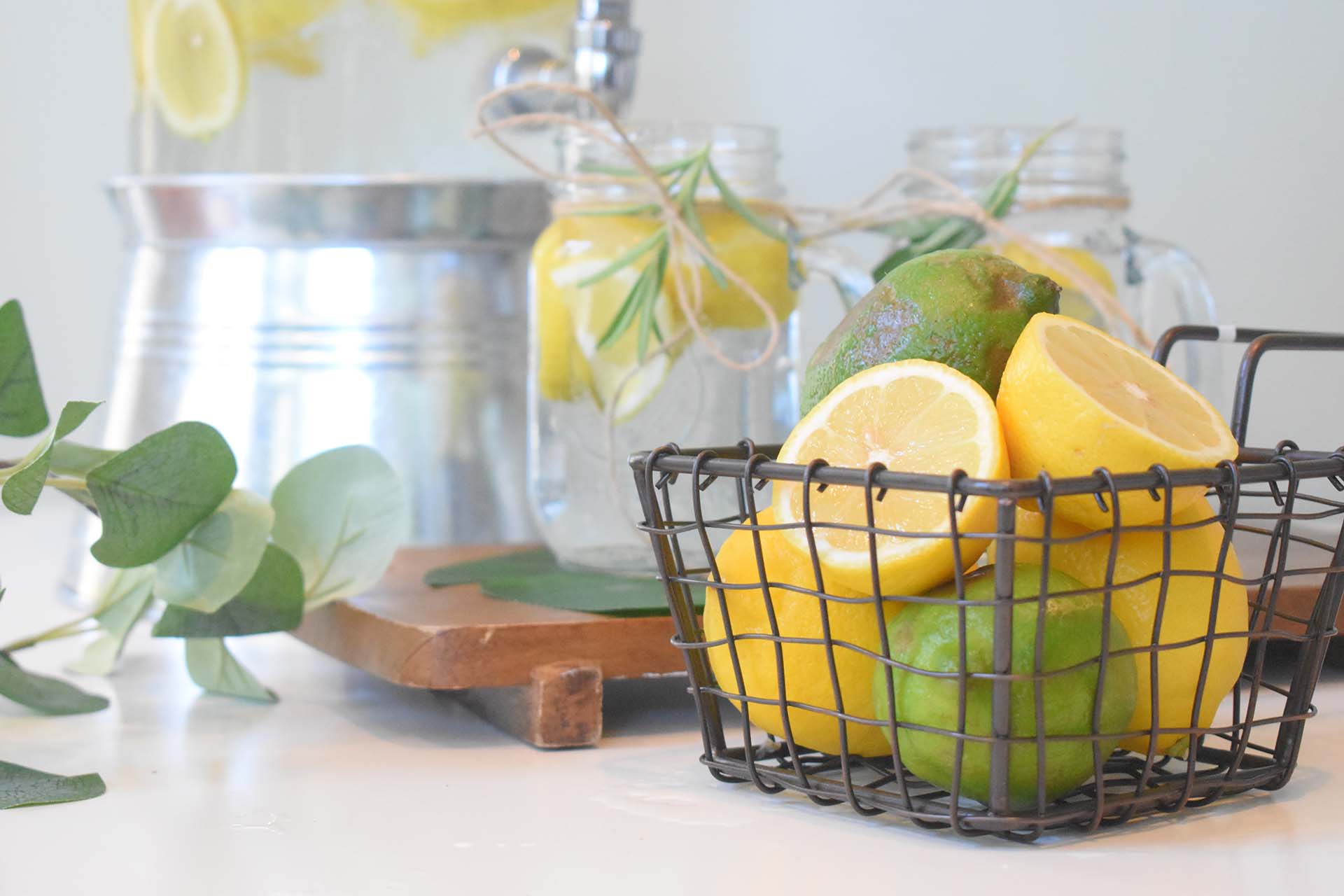
As you can see on desktop, this image is square. Make this image a 4:3 ratio on tablet and back to square on mobile. Don’t forget to take away the extra padding on the text column on mobile. Each column should be centered and 10 wide on mobile.

We rely on column widths as much as possible to limit text length and help break text into multiple lines. However, relying on the column is not enough to avoid “widows” and “orphans” in the text and does not help when we need to break the text in a specific place. Using the break html tag can help us fix this.
This title breaks in the optimal place on desktop using the <br> tag. On tablet and mobile, hide the <br> without adding any custom code (you can add existing classes). Make sure to left align all the text on mobile and keep it centered on Desktop. Go to full width, 10-wide columns on tablet.
Lorem ipsum dolor sit amet, consectetur adipiscing elit. Morbi ut orci mi. Cras eget tortor massa. Sed at interdum libero, vel aliquam sem.
Lorem ipsum dolor sit amet, consectetur adipiscing elit. Morbi ut orci mi. Cras eget tortor massa. Sed at interdum libero, vel aliquam sem.
Lorem ipsum dolor sit amet, consectetur adipiscing elit. Morbi ut orci mi. Cras eget tortor massa. Sed at interdum libero, vel aliquam sem.
Lorem ipsum dolor sit amet, consectetur adipiscing elit. Morbi ut orci mi. Cras eget tortor massa. Sed at interdum libero, vel aliquam sem.
Lorem ipsum dolor sit amet, consectetur adipiscing elit. Morbi ut orci mi. Cras eget tortor massa. Sed at interdum libero, vel aliquam sem.
Lorem ipsum dolor sit amet, consectetuer adipiscing elit, sed diam nonummy nibh euismod tincidunt ut laoreet dolore magna aliquam erat volutpat. Lorem ipsum dolor sit amet, consectetuer adipiscing elit, sed diam nonummy nibh euismod tincidunt ut laoreet dolore magna aliquam erat volutpat.
Lorem ipsum dolor sit amet, consectetuer adipiscing elit, sed diam nonummy nibh euismod tincidunt ut laoreet dolore magna aliquam erat volutpat.
Click me!

Lorem ipsum dolor sit amet, consectetuer adipiscing elit, sed diam nonummy nibh euismod tincidunt ut laoreet dolore magna aliquam erat volutpat. Lorem ipsum dolor sit amet, consectetuer adipiscing elit, sed diam nonummy nibh euismod tincidunt ut laoreet dolore magna aliquam erat volutpat.
Lorem ipsum dolor sit amet, consectetur adipiscing elit. Morbi ut orci mi. Cras eget tortor massa. Sed at interdum libero, vel aliquam sem.
Sign Up!